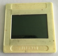
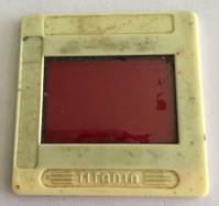
There is a very easy way to make a couple of filters to help in distinguishing reds from green & vice versa. I cut & mounted two pieces of coloured film, one 'red' & the other 'green' to fit between the glass sheets of two 35 mm photographic slides.
Red Green
This has proved very effective when used in good daylight. Use under artificial light should always be checked against results from good daylight conditions.
For painting in artificial light, you should make use of a table lamp fitted with a 'Daylight' bulb. Normal house lighting bulbs don't produce normal daylight and any painting started in daylight can be quickly spoiled as the lighting affects what one sees from mixing. To resolve this problem I bought a table lamp with a fluorescent daylight tube which allows me to paint during the winter months.
Looking through the red filter at anything red appears to lighten the colour viewed. Change to the green filter & anything red becomes darker. Now for anything green, looking through the green filter enhances or brightens anything green.
I learned of this approach from 'Tomorrow's World', a television programme broadcast in the 1970s. It dealt with the development, in the USA, of spectacles with a combination of lenses with the 2 colours, and there had been some success. Some advances have been made, but those spectacles don't appear to solve the problem for everybody. So I still use my two filters when painting to make sure I don't loose colour harmony. I remember one occasion on an art course at my local art school when I painted a fishing net green and didn't check it with my filters. When the mentor / tutor looked at my painting he told me me to change the colour to a brown with Burnt Sienna as the green net affected the colour harmony of my painting. I couldn't see the difference, but he & those in the class with normal colour vision spotted my error immediately.
Now a few years ago I learned of an App I could install on my iPhone for checking colours. This is a useful tool & is available to download onto an iPhone from the App Store. The App, called Color BlindPal uses the iPhone's back camera. By placing the onscreen centre of the black cross intersection on the colour of which you are uncertain, the name of it will appear, at the foot of the screen. It works incredibly well provided you use it in good daylight, preferably from the North. You must have really good lighting when using this App as errors do occur under poor lighting. Though it is very helpful, I still use my filters which have proved over many decades now to be the most reliable way to differentiate between red & green.
Those with normal colour vision find it difficult to understand that people with the red/ green deficiency can actually see any colour at all, because they think that we live in a black & white world. Nothing can be further from the truth as I do see both red & green. The difficulty arises when the lighting is poor and the shades of both colour become paler. I do see both red & green like the red of a postbox or the green of grass. With clothing I have to be careful, so I normally opt for browns. My approach to minimising difficulties with colour vision is ONLY for those of us affected by red /green colour blindness; however, they may help those with other types of colourblindness. I do know that there are many artistic people in the world who would love to paint pictures but have been put off at an early age mainly due some thoughtless comments. Creative people are very sensitive individuals and often will give up too easily.
I hope, through work of many decades, to illustrate on this website, how I've coped with my particular colour blindness. I read various art magazines, like 'Leisure Painter' & 'the Artist', and have yet to come across any article addressing colour blindness, or any project suited to those who have colour sight deficiencies. I often take a series of photos as I progress with a painting, it has proved most valuable and interesting. However, from my own experience over many decades with the articles published, the assumption is that readers have normal colour vision. I do know that art schools & others providing recreational art courses all accept those interested in the creative arts. I have learned that in some ways those of us who are deemed colourblind have an advantage over those with normal colour vision in that we can create a far greater range of shades of greys between black & white when creating a grey scale. We aren't inhibited like those with normal colour vision. Something else little known is that many of the world's greatest artists were also colourblind. Those of us who are strong-willed refuse to give up, so don't be timid and follow my example & get painting!
Please feel free to contact me as I'm here to help & encourage. Use my Feedback link & I will reply.
© T.C.Wratten, 2020